In modern security operations, data overload is a growing problem. The question isn’t whether data exists—it's whether it’s actionable.
That’s why AirGuard doesn’t just collect data—it helps you understand it. One of the platform’s most strategic tools is its heatmap feature, found within the Analytics chapter. Designed to make sense of historical drone activity, AirGuard’s heatmaps give security leaders a visual, pattern-based view of drone behavior over time.
Instead of scrolling through lists of past detections, you can see exactly where drones are flying, launching, and being operated from—then use that information to adjust protocols, shift resources, and stay ahead of threats.
A Closer Look at the Heatmaps
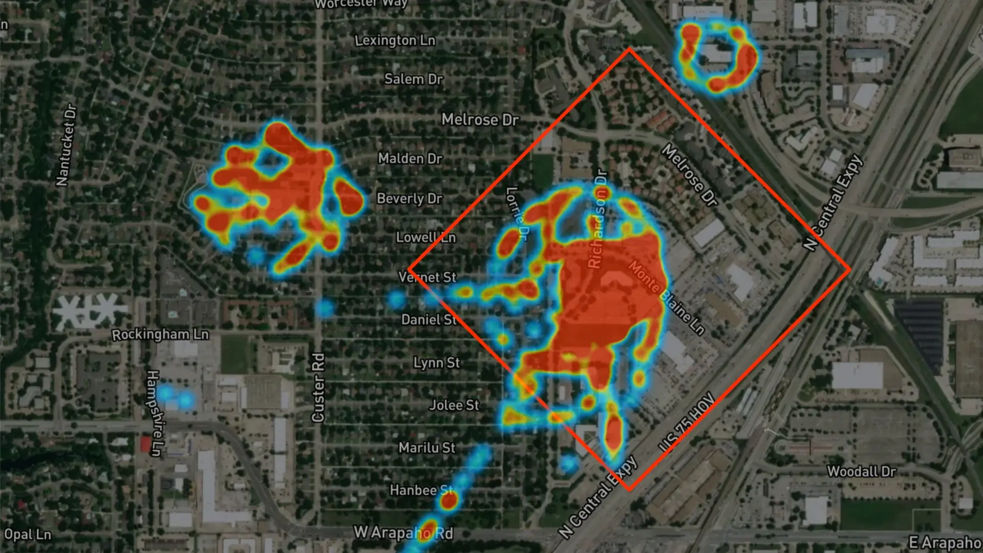
AirGuard’s Analytics chapter goes beyond raw logs by providing visual heatmaps that reveal where drone activity is concentrated—turning historical detections into clear, actionable insights. Users can filter by time period (like “Last Week”) and toggle between different map views.
Here’s how each heatmap layer helps you understand drone behavior patterns:
🔴 All Flight Points

This heatmap visualizes every GPS point recorded during drone flights within your detection zone. The result is a clear spatial overview of drone activity—highlighting areas where drones spend the most time or fly most frequently. Red zones represent high-density flight paths; cooler colors show less frequent movement. This helps pinpoint areas of persistent drone interest, often aligned with surveillance routes or repeated flyovers.
🟠 Takeoff and Landing Locations

Using the first GPS point of each flight, this layer shows where drones typically take off or land. These patterns can help identify staging areas—such as residential backyards, parking lots, or alleyways—used repeatedly to launch drone operations near your facility.
🟡 Pilot Locations

This map highlights where drone operators were physically located during their flights, based on pilot GPS signals. Over time, these locations can show where individuals consistently operate drones from, which can inform surveillance, patrol planning, or law enforcement coordination.
Each of these maps is overlaid on satellite imagery, giving you real-world context for drone activity hotspots—right down to specific intersections or buildings.
On the right-hand side of the dashboard, additional analytics provide:
-
Violation summaries such as flights above 400 ft, exceeding 10 m/s speed, or operating beyond visual line of sight (BVLOS).
-
A breakdown of flight distances from the pilot—helping you assess how aggressively or stealthily drones are being flown.
How Security Teams Use Heatmap Intelligence
The value of these maps isn’t theoretical—it’s operational. Security directors and analysts can use AirGuard’s heatmap insights to:
- Identify drone traffic patterns and anticipate repeat incursions
- Refine patrol schedules based on real-world drone activity trends
- Adjust alert zones to better align with frequently targeted locations
- Coordinate with law enforcement by sharing likely pilot origin points
- Train response teams using historical patterns as the foundation for exercises
- Measure the effectiveness of deterrents—if a new camera or patrol was deployed, did the flight paths change?
All of this feeds into a smarter, more proactive airspace security strategy.
From Historical Data to Forward-Thinking Strategy
Historical data is only powerful when it helps you change the future. AirGuard’s analytics and heatmap tools turn raw flight logs into a strategic asset—a visual blueprint of your local drone threat landscape.
For organizations serious about securing their airspace, it’s not enough to respond in the moment. You have to learn, adapt, and plan ahead.
With AirGuard, you're not just watching drones—you’re understanding the people behind them.